Font Choice

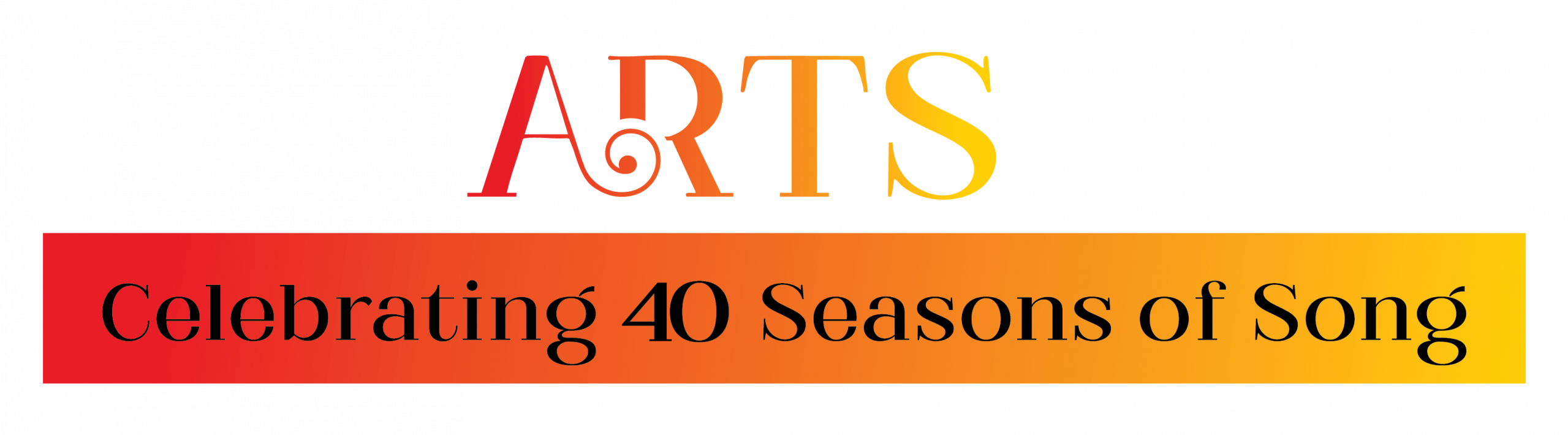
Matterdi was chosen for its graceful, high-contrast letterforms that exude sophistication and artistry.
The font’s delicate serifs and refined curves enhance readability while adding a timeless, musical quality.
Balances classical elegance with a contemporary edge, making it timeless yet fresh.
Design Aspects

Hierarchy: “ARTS” is the focal point, emphasizing creativity and artistic expression within the group.
Contrast: Black for “Choral” and “Society” provides strong readability, while the vibrant colors of “ARTS” draw attention and evoke energy.
Color Meaning: The gradient from deep red to golden yellow symbolizes passion, warmth, and movement—qualities associated with music and performance.
Feeling of Music: The colors mimic the dynamic flow of sound, transitioning smoothly like a musical crescendo.
Accent

Expressiveness: The swirl adds a touch of elegance and artistry, reflecting the fluidity of music.
Symbolism: It subtly resembles a treble clef or a musical flourish, reinforcing the choral theme.
Balance: The decorative element keeps the design sophisticated without overwhelming readability.
Uniqueness: Sets the logo apart with a distinct, memorable touch that conveys creativity.